🔧 Motivation
For a long time, I was bothered by the outdated screen layout of the 4.7", 5.83", and 7.5" models compared to the larger 10" model. The interface felt underutilized and inefficient. 😕
📌 Main Reasons for the Change
- ⚠️ When inverter data was missing, the layout looked empty and unfinished.
- 📉 Minor information (e.g., phase load, strings) took up unnecessary space — which remained blank when data wasn’t available.
- 📊 We have access to 5-minute data on daily production, consumption, and battery status — but weren’t using it.
- 🔋 The battery icon did not show its current status.
- 📈 Proportional statistics of daily production/consumption were available in the station but not displayed.
- 👀 On the 4.7" model, readability was significantly limited.
✨ New Layout
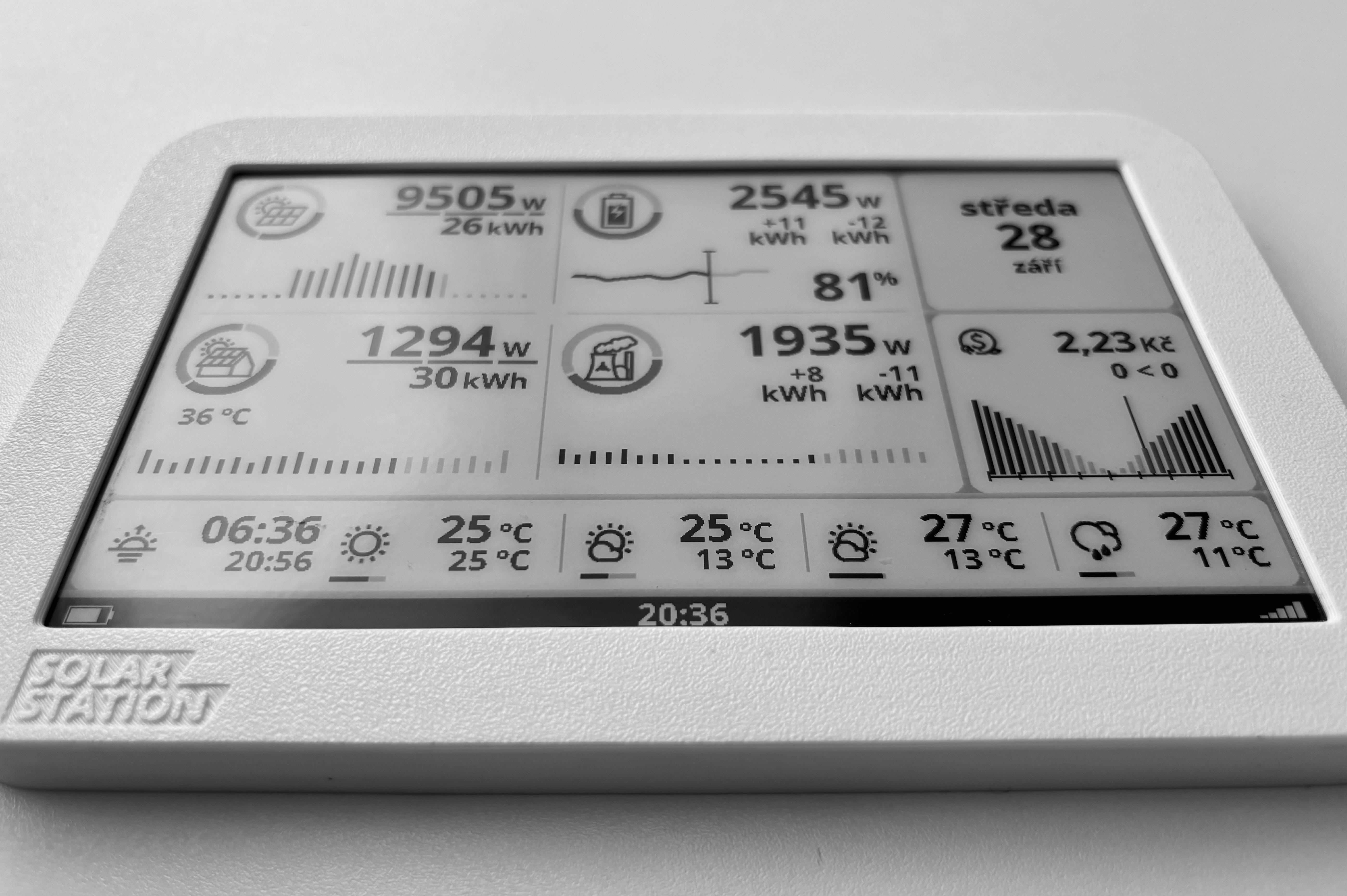
Together with the designer, we created a new arrangement — still four tiles, but each now displays the maximum available information in any state. 📱➡️📊
✨ Production
- ⚡ The production ring shows the proportion of energy usage – to the grid (black), to the battery (gray), and direct solar consumption (light).
- 📊 Individual strings are now subtly displayed with a proportional bar – you can immediately see which contributes the most to production.
- 📈 The graph displays production for today and yesterday, allowing easy comparison. In the morning, an overview of yesterday’s production is also available.
✨ Battery
- 🔋 The battery ring shows the ratio of charging and discharging.
- ⚙️ Increased battery output – unified with other tiles.
- ➕➖ The + and – symbols show the amount of energy charged and discharged today.
- 📊 The graph shows battery usage during today compared with yesterday.
- 📱 The icon displays the current battery level (in percent); a lightning symbol indicates charging is in progress.
✨ Consumption
- 💡 The ring shows the share of consumption – from the grid (black), from the battery (gray), and directly from solar (light).
- ⚖️ Inverter phases are now displayed as proportional bars – you can instantly see which phase is overloaded (shown in black).
- 📦 Total energy consumed for the current day.
- 🌡️ If available, the inverter temperature is displayed below the icon.
- 📈 The graph shows hourly consumption – black for today, gray for yesterday. You can easily see, for example, if nighttime consumption was higher.
✨ Grid
- ❤️⚡ The heart-power-plant icon remains.
- 🌀 The ring shows the ratio of sale and purchase.
- ➕➖ The + and – symbols show today’s sale and purchase.
- 📉 The daily graph displays grid usage by the hour – purchase is shown as negative, sale as positive.
🧩 Design Principles
Each element is designed to be self-explanatory – at least for an experienced “solar enthusiast” ☀️.
For everyone else, a clear manual will be available. 📘
—
L.


